AE Tech
AE-Tech, a leading electrical contractor, needed a brand refresh to stand out in a competitive market and align more closely with their primary contractors. Their previous branding, featuring a generic blue-and-white logo, blended in with countless other electricians. Bamboo Manchester reimagined their identity, creating a bold, dynamic brand that reflects their expertise and professionalism.

Dynamic Logo design
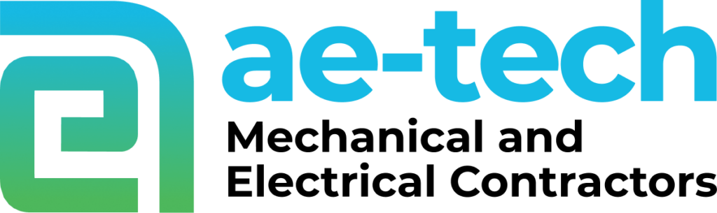
AE-Tech’s new logo merges the letters A and E into a striking, modern ident resembling an @ symbol, reflecting their tech-driven ethos. The fresh green-and-blue palette replaces the generic blue-and-white design, creating a professional yet unique identity that aligns with their industry while standing out from the competition.
Stylish and Functional Uniforms
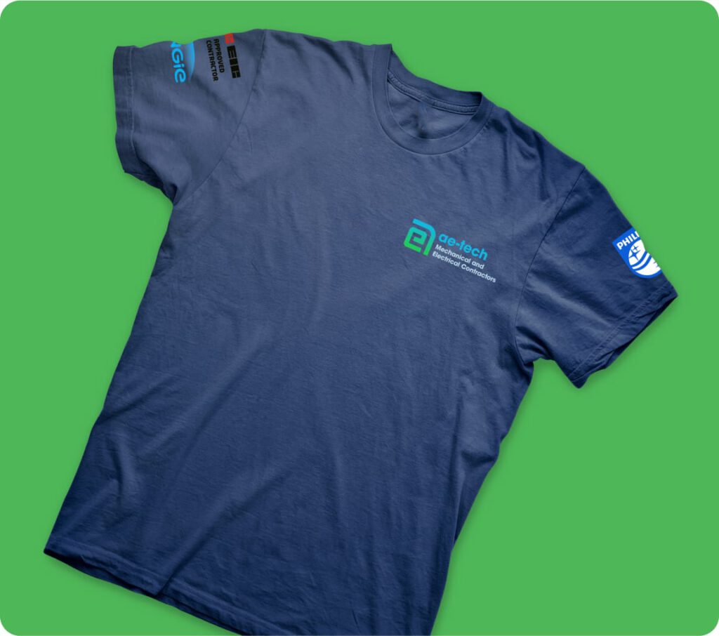
Inspired by British Super Bikes, we designed t-shirts that staff are proud to wear. Combining comfort with a sleek aesthetic, the uniforms ensure a cohesive, professional appearance on job sites and enhance team cohesion.
Comprehensive Branded Collateral
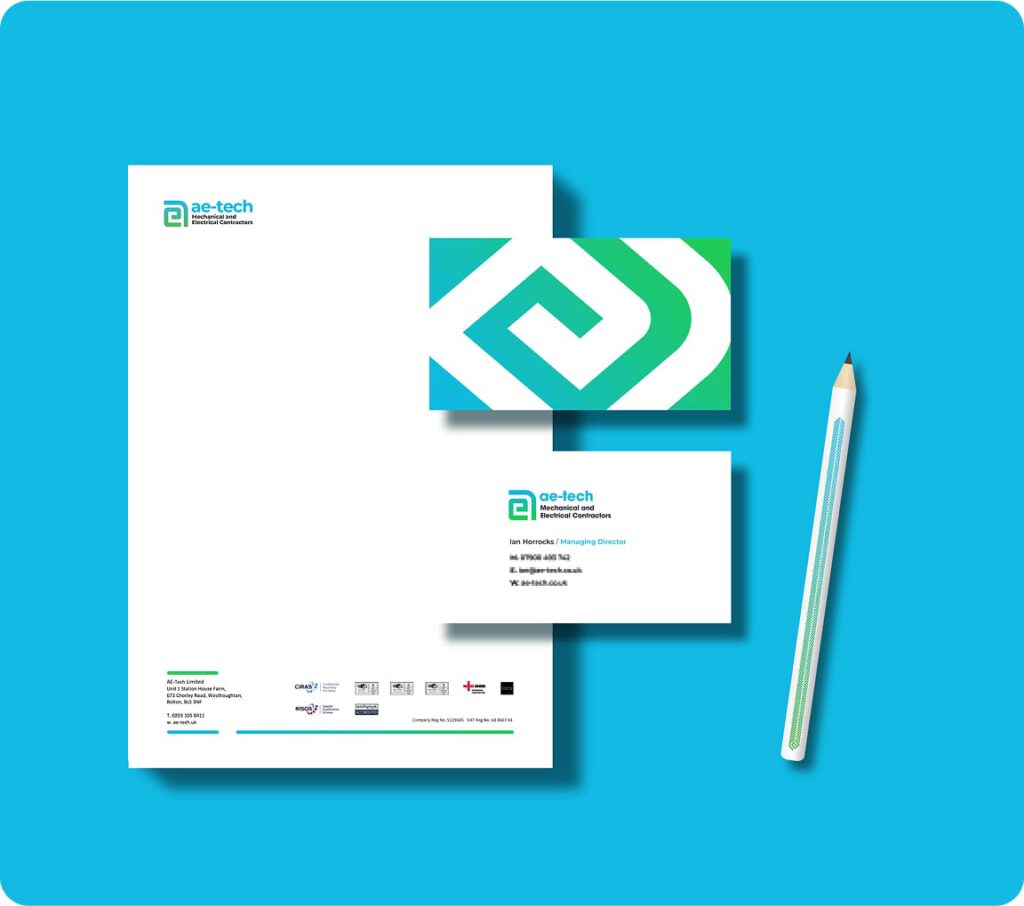
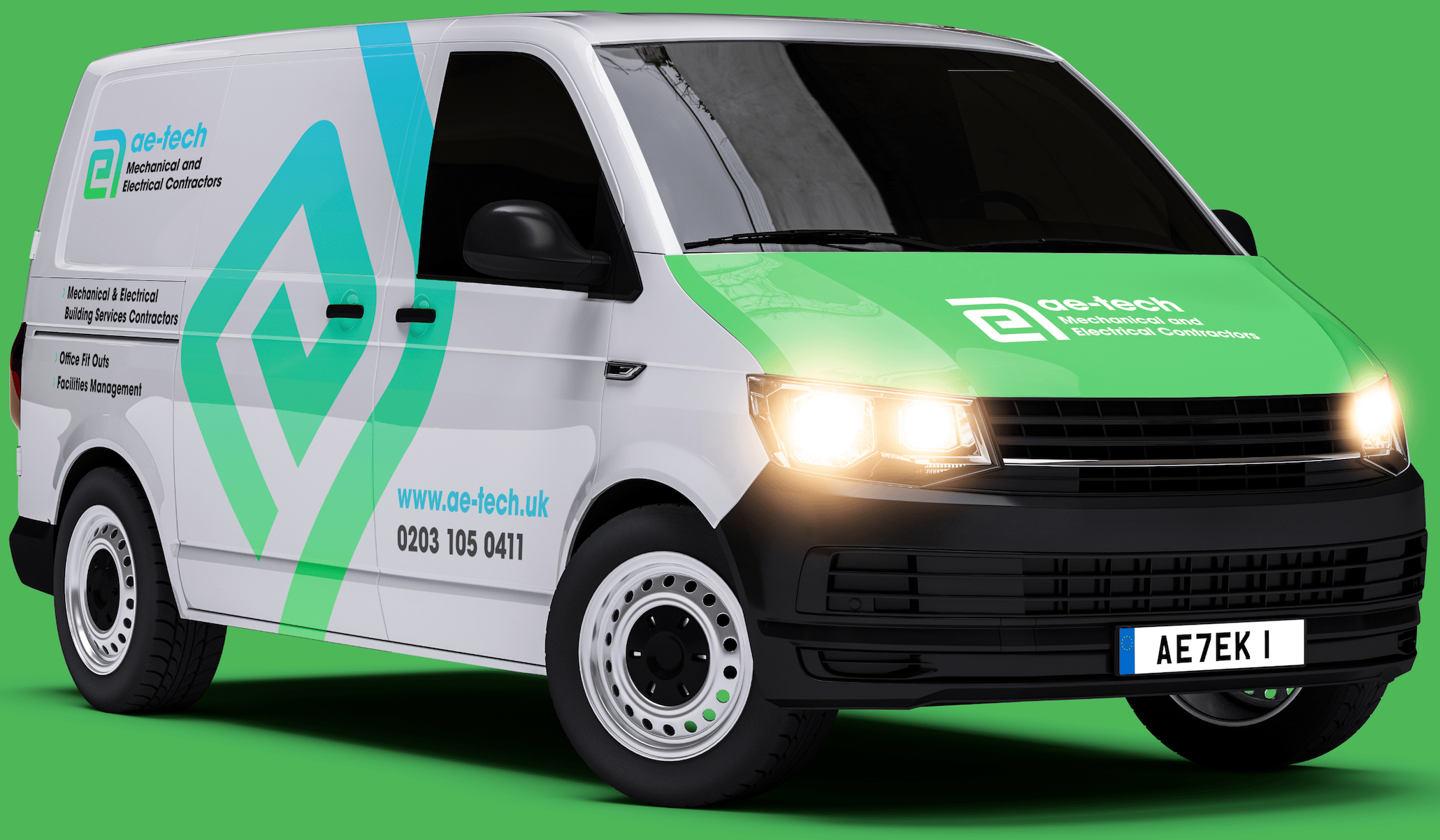
We created clean, modern business cards and bold van designs featuring the new logo, ensuring AE-Tech’s branding is visible and consistent across all platforms. This cohesive branding reinforces their professionalism and leaves a lasting impression.
Fleet Designs with High Impact
The van designs were created to ensure AE-Tech’s fleet would grab attention wherever they go. The striking green and blue color scheme was paired with a large, slanted logo for bold impact, with supporting business information—such as the website and email address—positioned clearly on the right. This design not only reinforces the brand but also ensures their vehicles double as mobile advertisements, enhancing visibility in every location.
Results That Matter
The rebranding has elevated AE-Tech’s market presence, making them instantly recognisable, aligning their image with key contractors, and fostering internal pride among staff – all while reinforcing their commitment to excellence.
Bamboo delivered a brand we could stand out and be proud of. The new look of the logo with the ae incorporated into @ symbol was everything we were looking for and more!
Ian Horrocks | Managing Director
// More Web Designs